Fortis Boost
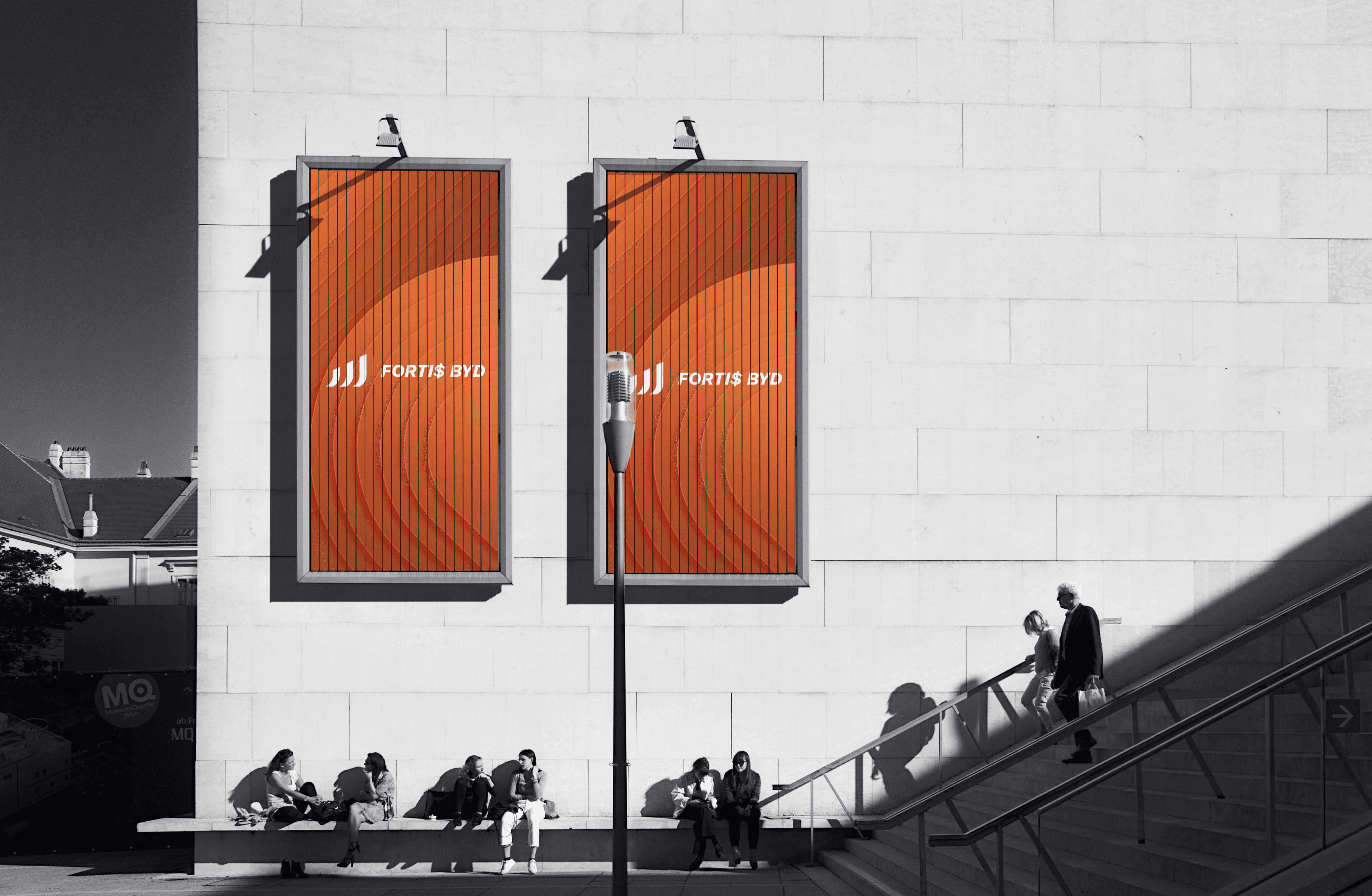
For Fortis Master, I designed a distinctive logo and visual identity for the brand, with the concept centred around the relationship between the letters *F* and *M*. The mark was developed to create a strong and recognisable symbol that reflects the brand name while remaining simple, versatile and suitable for both digital and physical applications. I explored the construction, proportions and visual balance of the two letters to create a cohesive monogram that could function independently as a brand mark as well as alongside the full Fortis Master wordmark. The result is a clean and professional identity that gives the brand a recognisable visual foundation.
Client
Marco van Os
Year
2023
Project type
Brand & Packaging Design
Credits
www.hortimol.net